House prices in East of England
Price per square metre data and charts to help you understand the housing market in East of England - stats were last calculated on 11 April 2026.
Defining 'East of England'
This boundary is taken directly from the Office of National Statistics area called East of England. It is shown in red on the map below.
Want to change geography?
You can click on the map above to change to a neighbouring region, or you can use the search form below.
Price per square metre
Knowing the average house price in East of England is not much use. However, knowing average price per square metre can be quite useful. Price per sqm allows some comparison between properties of different size. We define price per square metre as the sold price divided by the internal area of a property:
£ per sqm = price ÷ internal area
For example in February 2026, 40, Howland Garth, East of England, AL1 2NY sold for £607,500. Given the internal area of 102 square metres recorded on the EPC, the price per sqm is £607,500 ÷ 102 sqm = £5,955.
England & Wales have been officially metric since 1965. However house price per square foot is prefered by some estate agents and those of sufficiently advanced age ;-). You can change your prefered units from square meters to square feet for all the graphs and charts on East of England and elsewhere. Just visit the My Account page and look for the m2 to ft2 toggle switch. Alternatively just multiply everything by 10, move a decimal place to go from sqm to sqft and you'll be close enough as 1 sqm = 10.76391 sqft.
Distribution of £ per sqm for houses vs flats in East of England
Tip: click on the legend labels to show/hide different property types.
The chart above is called a histogram, it helps you see the distribution of house price per sqm in East of England To make this chart we put all the sales data into a series of £ per sqm 'buckets' (e.g. £4,215 to £4,481, £4,481 to £4,747, £4,747 to £5,013 etc...) we then count the number of sales with within in each bucket and plot the results. The histogram is based on 62,309 sales that took place in East of England in the last 12 months.
Generate a custom histogram like the one above but based on your own criteria.
You can see the spread of prices above. This is because although internal area is a key factor in determining valuation, it is not the only factor. Many factors other than size affect desirability; these factors could be condition, aspect, garden size, negotiating power of the vendor etc.
The spread of prices will give you a feel of the typical range to expect in East of England. Notably, only 25% of properties that sold recently were valued at more than £4,790 sqm. For anything to be valued more than this means it has to be more desireable than the clear majority of East of England homes.
Box plot of £ per sqm for East of England
Tip: click on the chart to see the values.
The chart above is called a boxplot (or a box-and-whisker plot). Box plots, like histograms, are used to graphically represent the distribution of data, showing the central tendency, spread of the distribution. In the context of £ per square metre property price distributions, box plots represent the variation in property prices within a geographic area e.g. East of England. The chart above shows a boxplot for 'East of England' broken down by property type (Flats, Semi-detached, Detached and Terraced). Almost everywhere houses command higher prices per square metre than flats, and detached houses most of all.
Box plot of £ per sqm for East of England (New vs Old)
The box plot above for the East of England region, is split by newbuild/existing as well as by houses/flats. It is interesting to see that the new-build premium for houses is 1.3%. Whereas the new-build premium for flats is 40.1%. This makes sense if you consider that older houses have more scope for extensions than new build houses. New build houses built to the maximum size a plot can take, tend to have smaller gardens. Flats are a different story, scope for extension doesn't play a role and interior standards matter more.
Does £ per sqm vary by property size and type?
A common question is whether price per sqm varies by property size and type. In other words can we fairly compare the price per sqm between two properties of different sizes? The charts below go some way to answering this question in the context of East of England. TLDR; there is some effect, but after you control for property type the effect is less than you might expect.
The first chart shows the distribution of price per sqm by property size. This shows that as the size of properties increase, there is not a significant corresponding change in £ per sqm. The second chart shows the same distribution split by property type. If you want the functionality to generate bespoke charts get in touch as it is a feature I could add to the subscription service if enough people are interested.
Density distribution
Price per square metre distribution by property size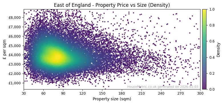
Shows the distribution of property prices per square metre in East of England.
Distribution by property type
Price per square metre distribution by size and property type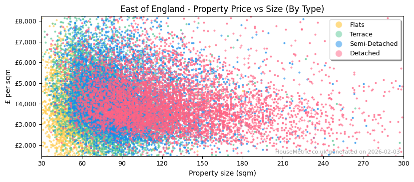
Shows the distribution of different property types in East of England.
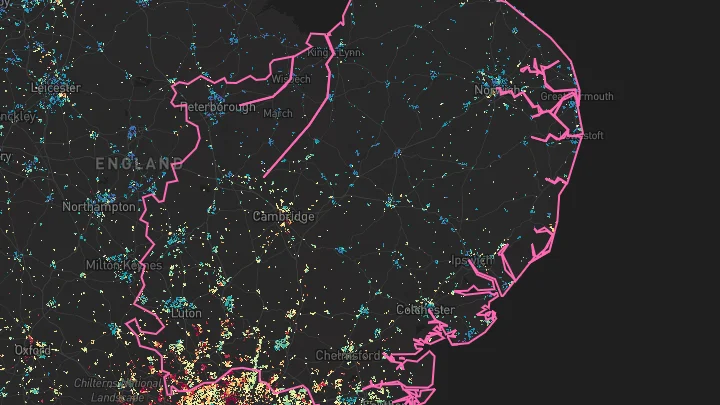
Property price map for East of England
Have a look at the interactive price map I created for myself. Use it to explore house prices in 'East of England' all the way down to individual property plots.
Will East of England house prices go up in 2025?
House prices in East of England fell -0.8% in the last year, -3.9% after inflation. Whether or not this trend will continue depends on many factors. Nobody can tell what East of England house prices will do in the future, but we can plot the price trends. I have done this in the chart below for East of England split by property type. You can extrapolate from this based on your own views on the future of wage growth, net migration, interest rates and the level of house building around East of England.
House price index for East of England
Tip: click on the legend items to show/hide different lines
Download house price index as CSV (premium users only).
The chart above shows changes in 'East of England' property prices over the last 20 years. The index is calculated from the average price paid per sqm for property in East of England and is set to 100 in 2004. The chart compares trends for Flats vs Houses in East of England. You can see how different they are. Keep this in mind when you see any price index that doesn't provide this breakdown.
The dashed lines show nominal house price changes, the solid lines show the same data adjusted for inflation. Economists call this the 'real' price change. You have to take inflation into account when comparing prices over time. It's calculated using the formula:
Real Rate of Return = (1 + Nominal Rate) ÷ (1 + Inflation Rate) – 1In this formula, the nominal rate is the rate of change before any adjustments, and the inflation rate is taken from the Consumer Price Index. The real rate of return is a more accurate measure of change in value, because £1 today does not have the same buying power as £1 in the past. For example, if a savings account pays an interest rate of 3% per year and the inflation rate is 5% per year, the real rate of return is -2%. This means that the investment's value is shrinking by 2% each year.
Historic returns for East of England
| All | Flats | Houses | ||||
|---|---|---|---|---|---|---|
| Nominal | Real | Nominal | Real | Nominal | Real | |
| 20 yr per annum | 2.9% | 0.1% | 1.7% | -1.0% | 3.1% | 0.3% |
| 20 yr total | 78.0% | 2.1% | 41.2% | -18.9% | 85.6% | 6.5% |
| 10 yr per annum | 2.4% | -1.0% | 0.9% | -2.4% | 2.6% | -0.8% |
| 10 yr total | 26.3% | -9.5% | 9.7% | -21.4% | 29.2% | -7.4% |
| 5 yr per annum | 1.3% | -3.5% | -0.1% | -4.9% | 1.6% | -3.3% |
| 5 yr total | 6.9% | -16.2% | -0.5% | -22.0% | 8.0% | -15.3% |
| 1 yr per annum | -0.8% | -3.9% | -3.1% | -6.1% | -0.8% | -3.8% |
| 1 yr total | -0.8% | -3.9% | -3.1% | -6.1% | -0.8% | -3.8% |
This table complements the house price index chart above, presenting the data in a more detailed format. It breaks down the information into 20-year, 10-year, 5-year, and 1-year periods, further categorized by property type. For each period, we display both a per annum rate of change and a total rate of change.
The total rate of change represents the overall change over the entire period. The formula for total return is:
Total return = (Index at end of period ÷ Index at start of period) - 1
The per annum rate of change is the annualized rate of change over the period. This is equivalent to the annual bank savings rate you would need to achieve the same total return over the given period. This annualized return is also known as the Compound Annual Growth Rate (CAGR). The formula for CAGR is:
CAGR = (1 + Total return) ^ (1 ÷ Number of years) - 1
Some specific examples:
- Over the past 20 years, Houses have seen a 0.3% annual change when adjusted for inflation. This translates to a total change of 6.5% in real terms.
- Over the past 5 years, All have seen a -3.5% annual change when adjusted for inflation. This translates to a total change of -16.2% in real terms.
Transaction volumes
Property transaction volumes in the UK follow a cyclical pattern. In addition to seasonal trends that occur annually, transaction volumes fluctuate with changes in house prices. When prices are rising, transactions typically increase, whereas falling prices tend to result in fewer sales, with only motivated sellers (e.g., due to death or divorce) entering the market. Exceptions to this trend often occur when changes to Stamp Duty drive a temporary surge in transactions.
Number of properties sold in East of England
The chart above shows the number of properties sold each month in East of England as reported by Land Registry. Key events highlighted include the Northern Rock bank run at the start of the 2007/8 Financial Crisis, the introduction of additional Stamp Duty on second homes in April 2016, the COVID-19 lockdowns and subsequent Stamp Duty holiday, and the 2023 interest rate rises. It's important to note that Land Registry reporting is lagged, particularly affecting new build sales, so treat the last year of sales volume data with caution. Based on historical reporting lags, I've provided a crude forecast of sales volumes for East of England, shown in yellow.
Nearby geographies
The table below shows how 'East of England' compares to the other regions.
| Region | Lower quartile | Median | Upper quartile | Sales in last 1yr |
|---|---|---|---|---|
| North East | £1,260 sqm | £1,860 sqm | £2,460 sqm | 29,203 |
| North West | £1,860 sqm | £2,540 sqm | £3,230 sqm | 75,382 |
| South East | £3,530 sqm | £4,330 sqm | £5,220 sqm | 90,365 |
| Wales | £1,820 sqm | £2,440 sqm | £3,090 sqm | 31,135 |
| London | £5,190 sqm | £6,340 sqm | £8,040 sqm | 56,776 |
| South West | £2,920 sqm | £3,560 sqm | £4,250 sqm | 61,303 |
| West Midlands | £2,320 sqm | £2,930 sqm | £3,530 sqm | 51,334 |
| East of England | £3,090 sqm | £3,850 sqm | £4,790 sqm | 62,309 |
| East Midlands | £2,220 sqm | £2,770 sqm | £3,330 sqm | 50,490 |
| Yorkshire and The Humber | £1,840 sqm | £2,450 sqm | £3,130 sqm | 55,346 |
Raw data
Our analysis of East of England is derived from what is essentially a big table of sold prices from Land Registry with added property size information. Below are three rows from this table to give you an idea.
| Address | Paid | sqm | £/sqm |
|---|---|---|---|
| 40, Howland Garth, | £607,500
Feb-2026
|
102 | 5,955 |
| 36, Arthur Rd, | £470,000
Feb-2026
|
63 | 7,460 |
| 29a, Ridgmont Rd, | £765,000
Feb-2026
|
108 | 7,083 |
Search the raw data here.
About
I created HouseMetric because I wanted to see this data and analysis myself, I also wanted to teach myself to build a website. Please give me feedback or spread the word about it. I'm constantly tinkering and adding more stuff to it.